
Worlds of Color
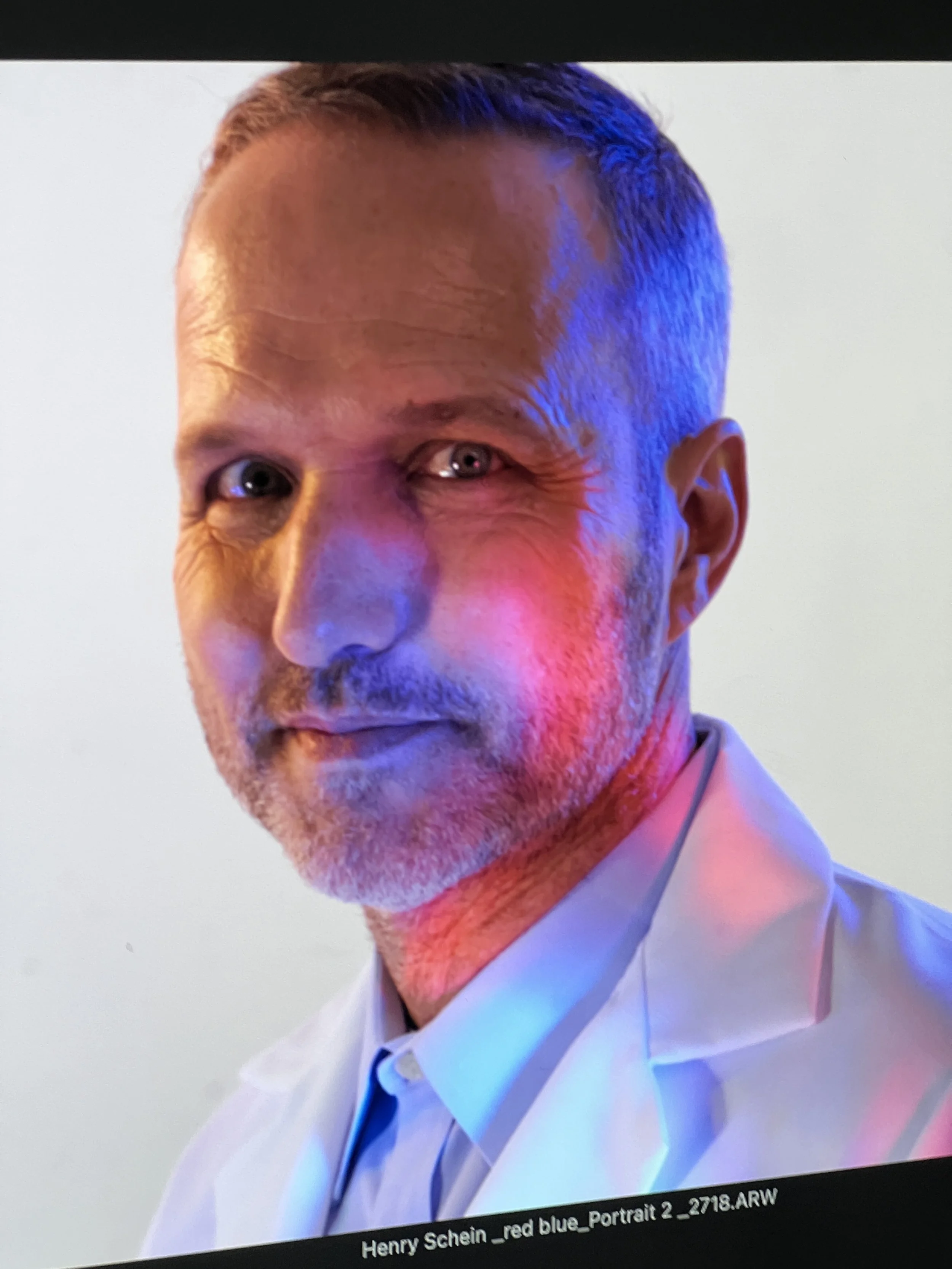
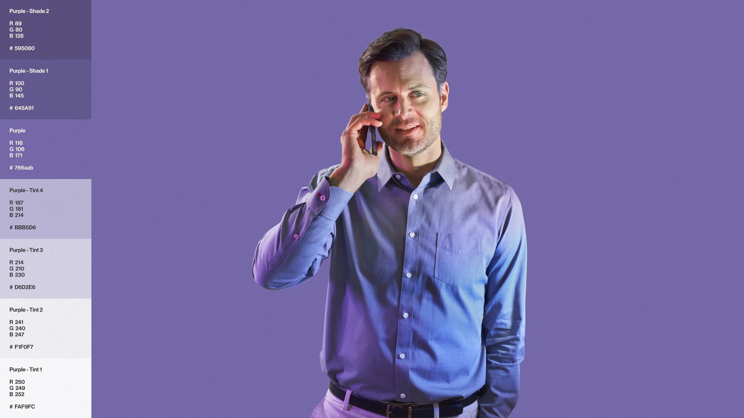
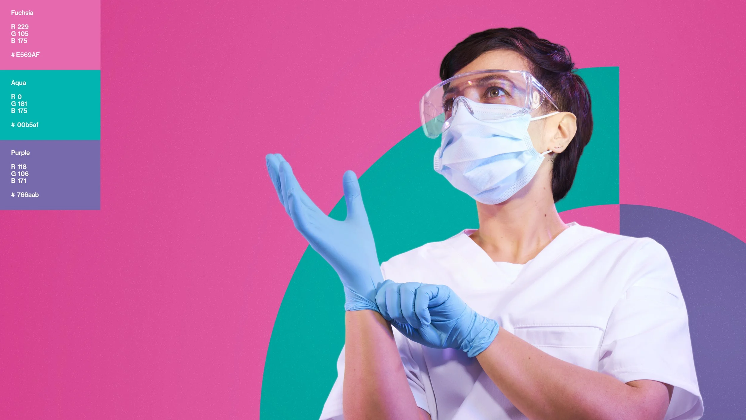
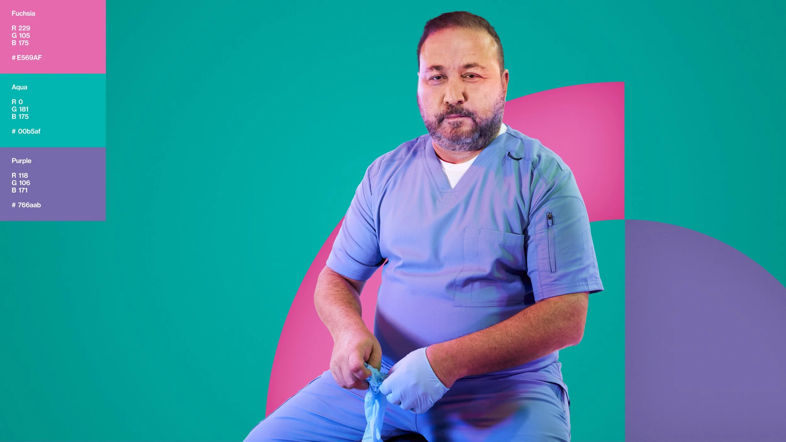
`Being one of the only dental distributors to general practitioners, specialists and labs, Henry Schein is the leading US healthcare distributor with millions of customers. I was tasked with creating an original photography look & feel for the brand, one that was color-forward, inherently versatile and future-focused. One that could stand as a is a lasting, authentic, and meaningful aspect of the brand experience.
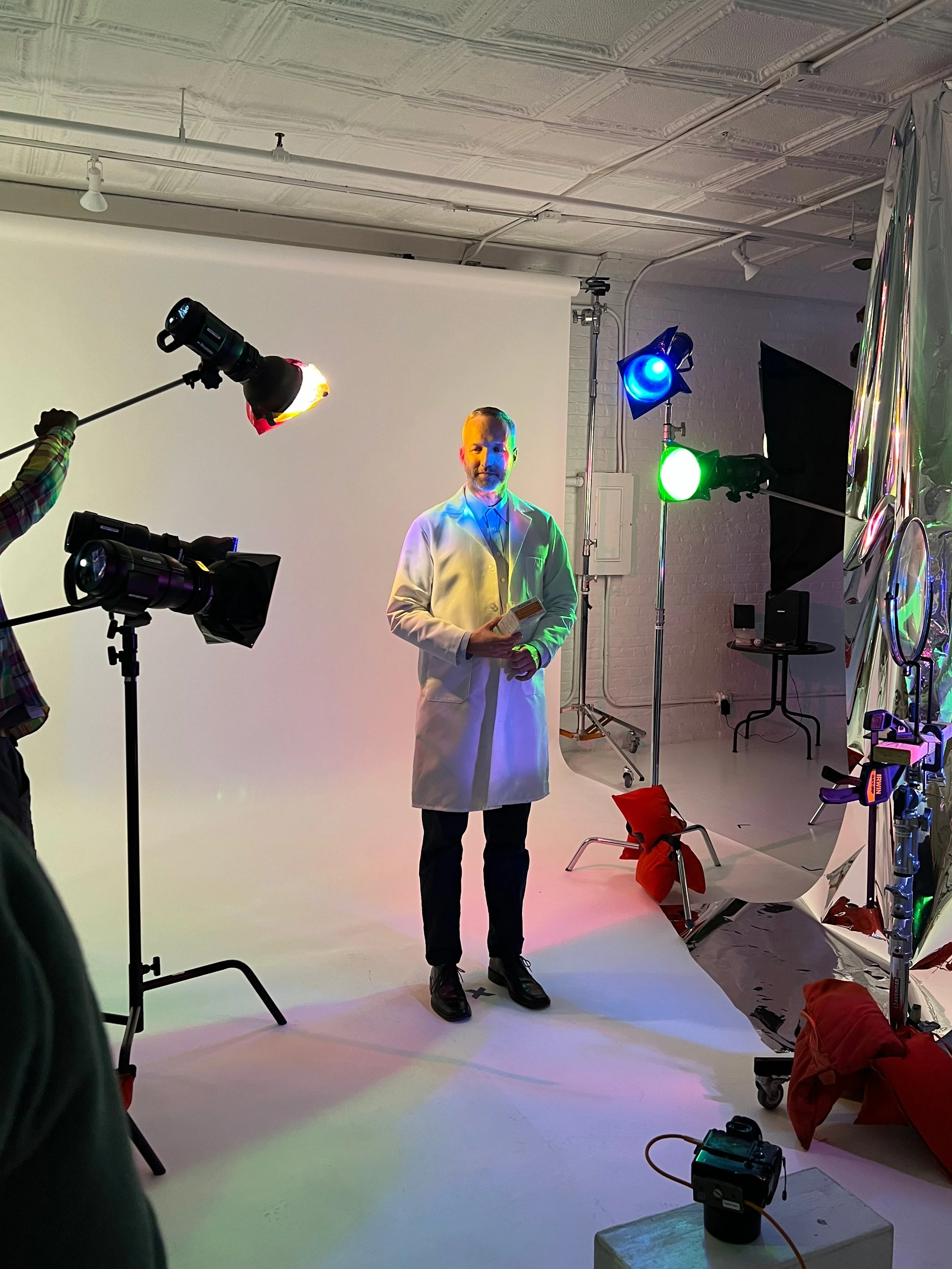
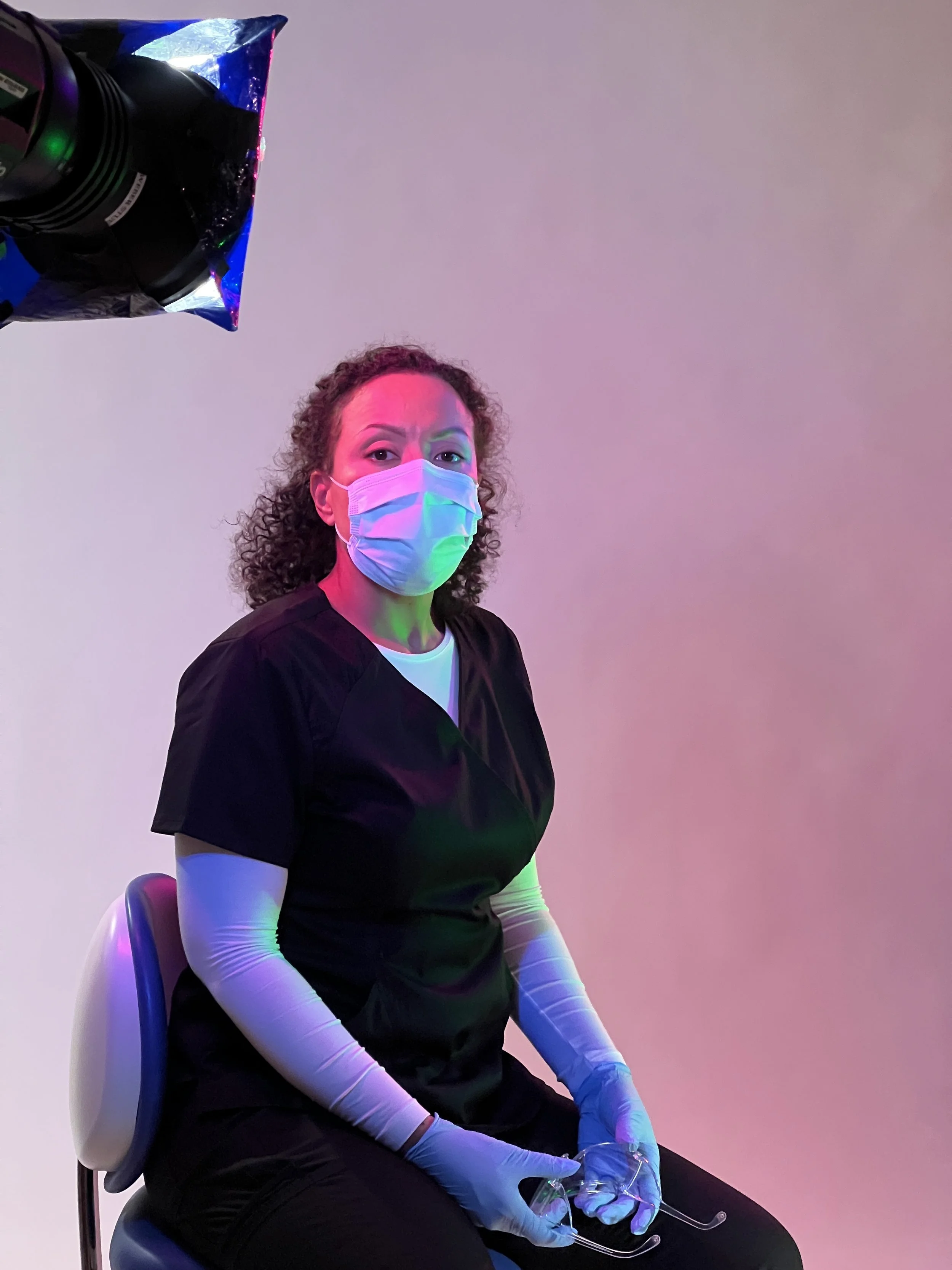
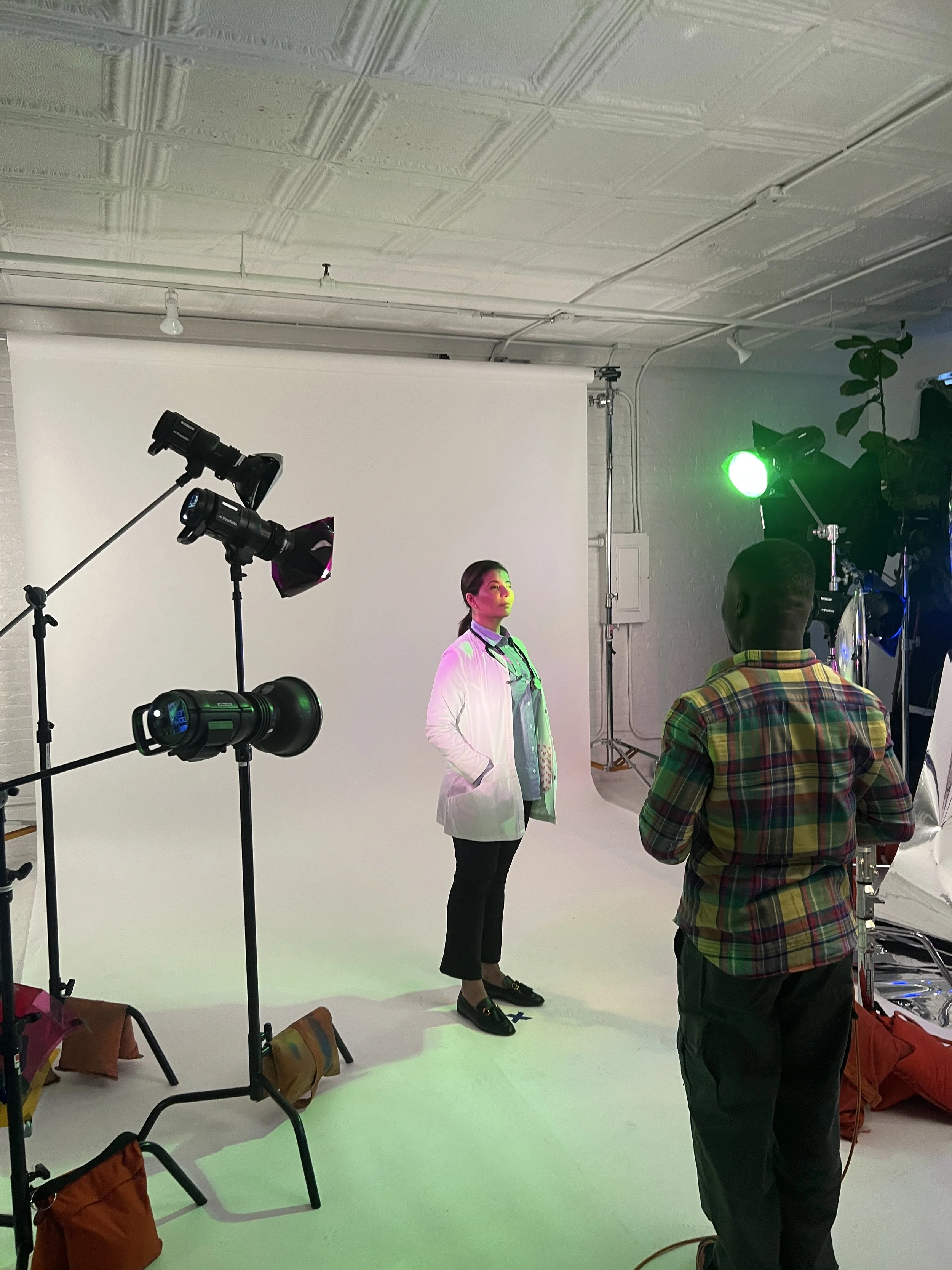
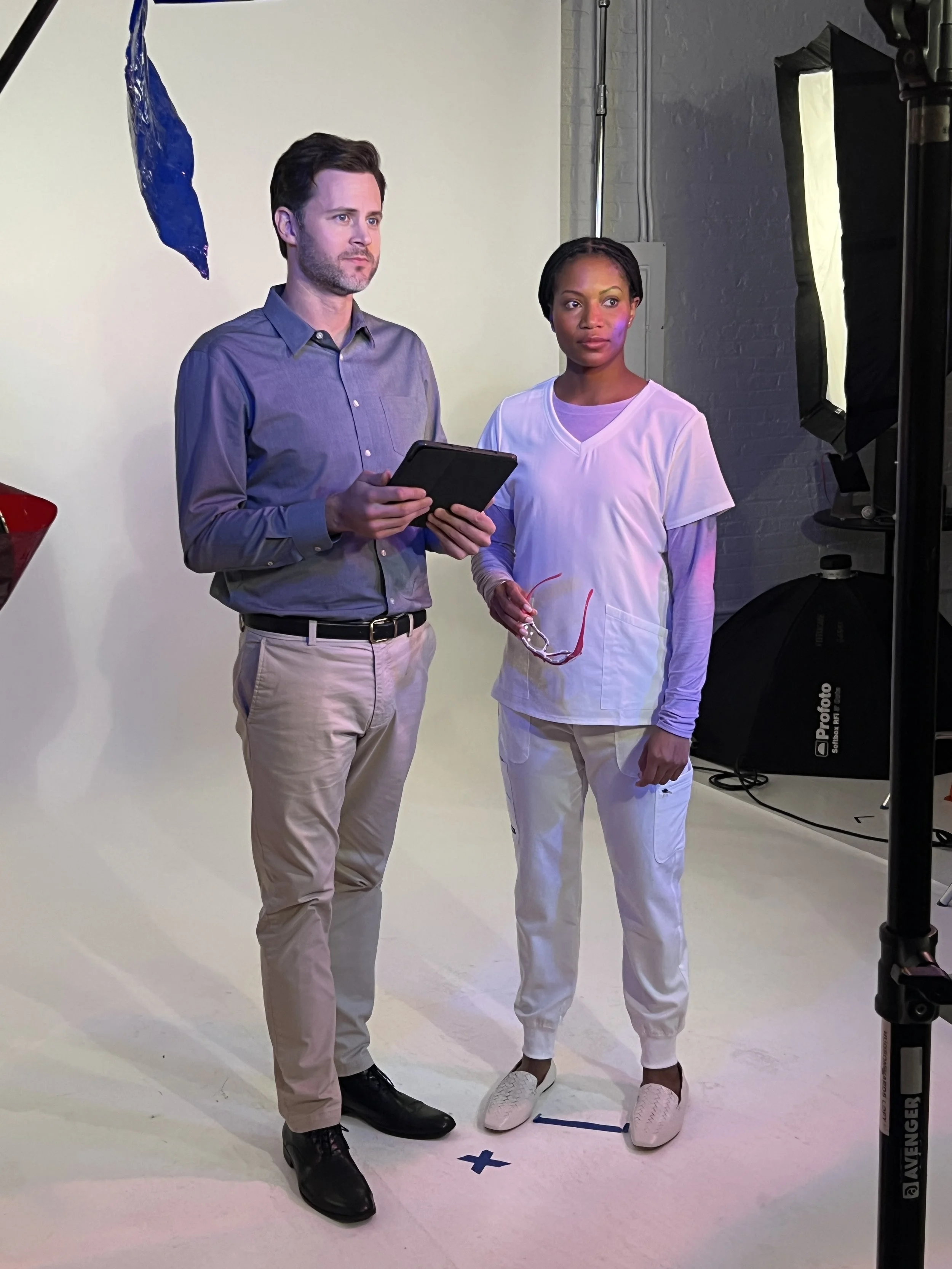
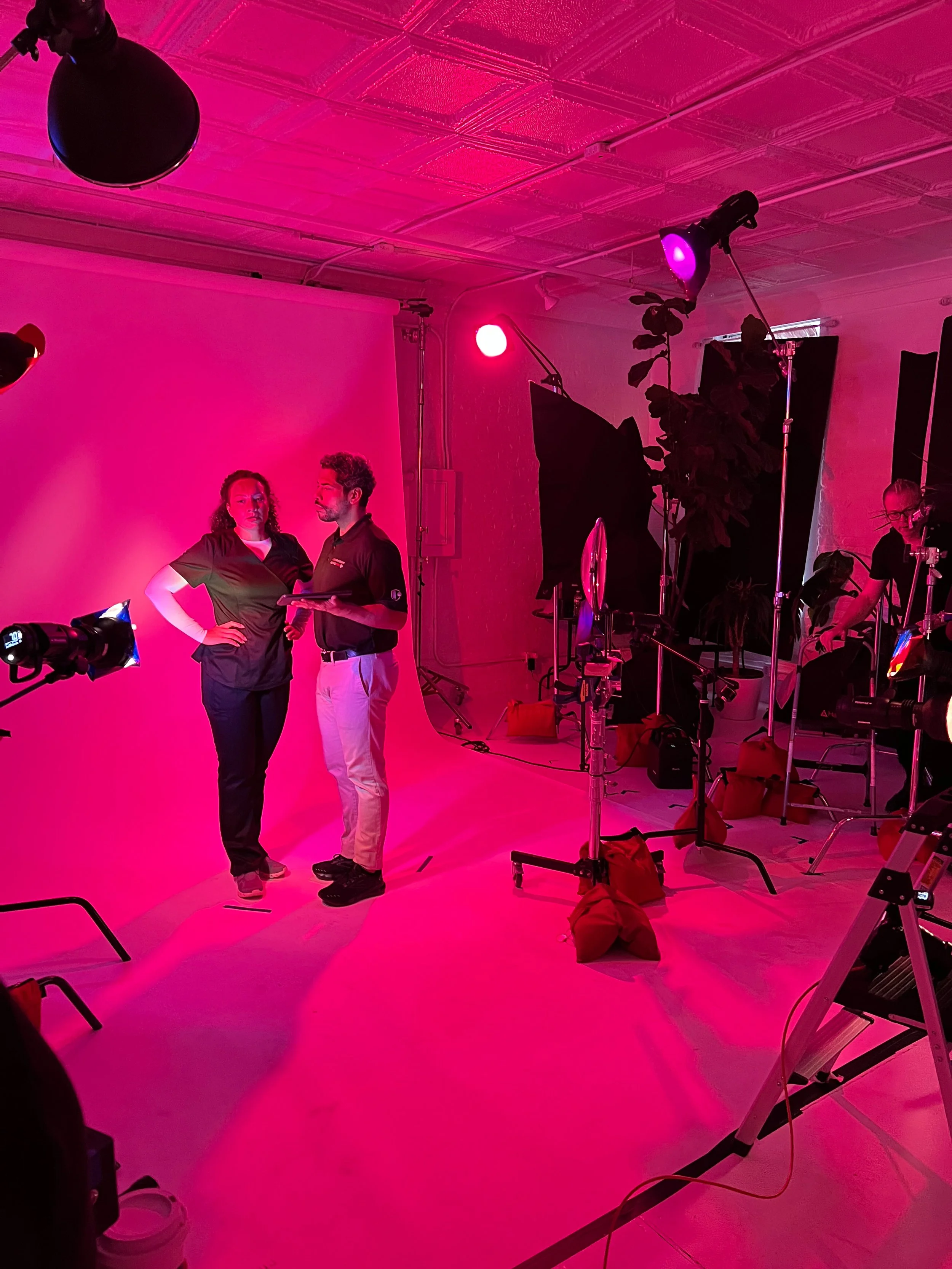
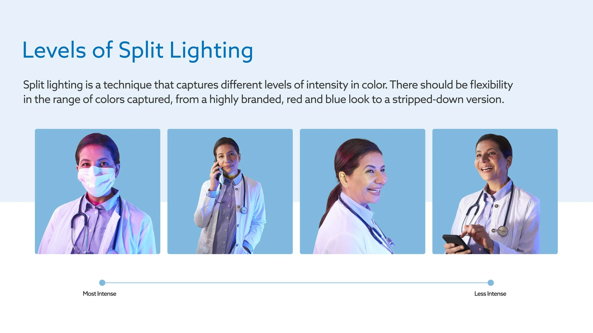
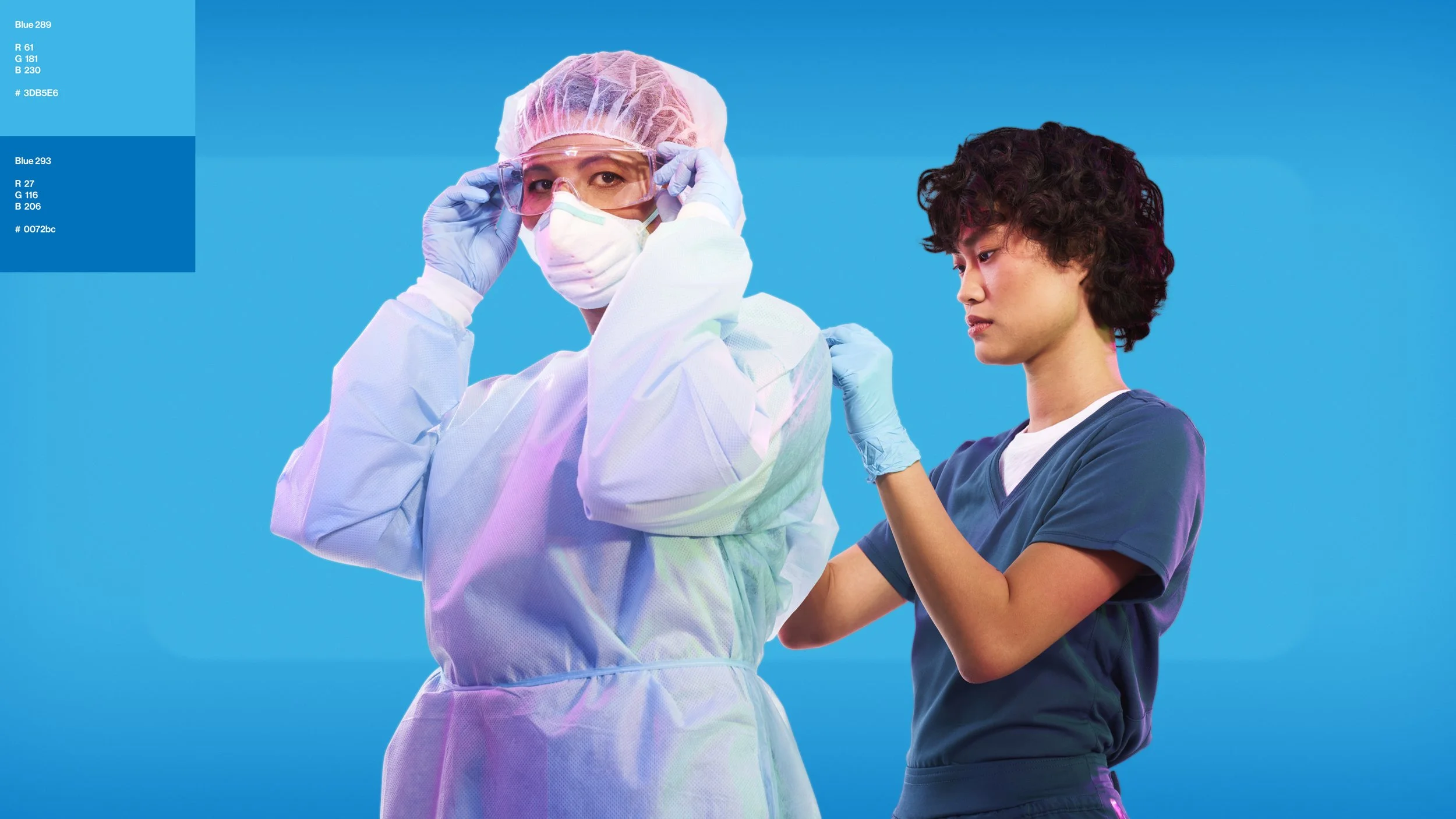
The concept uses the simplest elements (Light and Space) to create a window into the bright and optimistic future of the industry. Working with photographer Mamadi Doumbouya, we created a organic system of split lighting that accentuates the subject and creates a unique look that adds dynamism to the composition. Fields of light, color and shape interact with space to reveal around the subject visually striking compositions full of volume and mood.
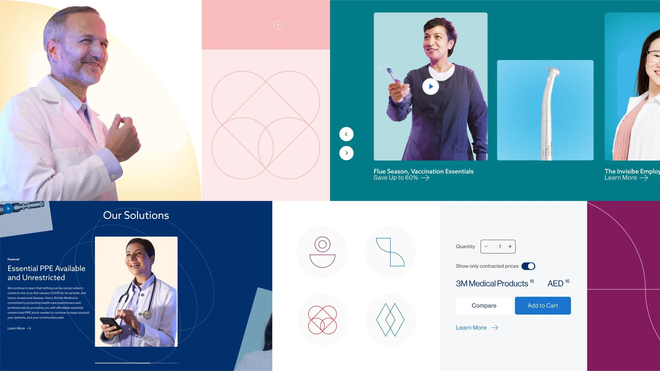
The look & feel was ultimately deployed through a toolkit containing dozens use-ready images and over 230 unique backgrounds, along with usage samples and an interactive workspace. This comprehensive Figma-based toolkit powers almost endless original artwork possibilities for partners and third parties to deploy the concept across markets.






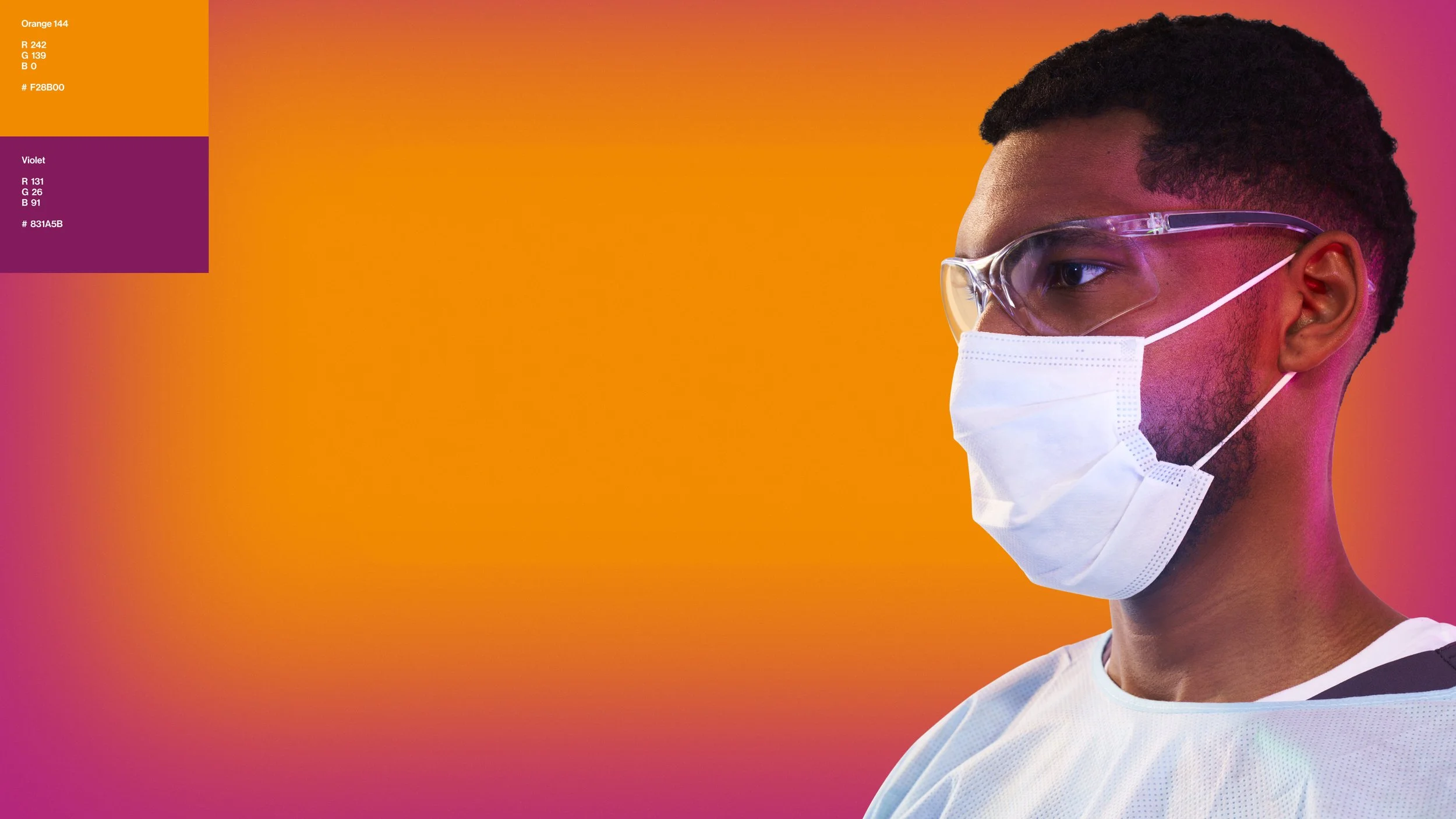


As Henry Schein’s subsidiary brand in the UK, we also created a Kent Express-specific variant of the look and feel, complete with a color scheme and UK-only assets. This approach trickled down to a myriad of considerations on set to stay true to the requirements and authenticity of each market.




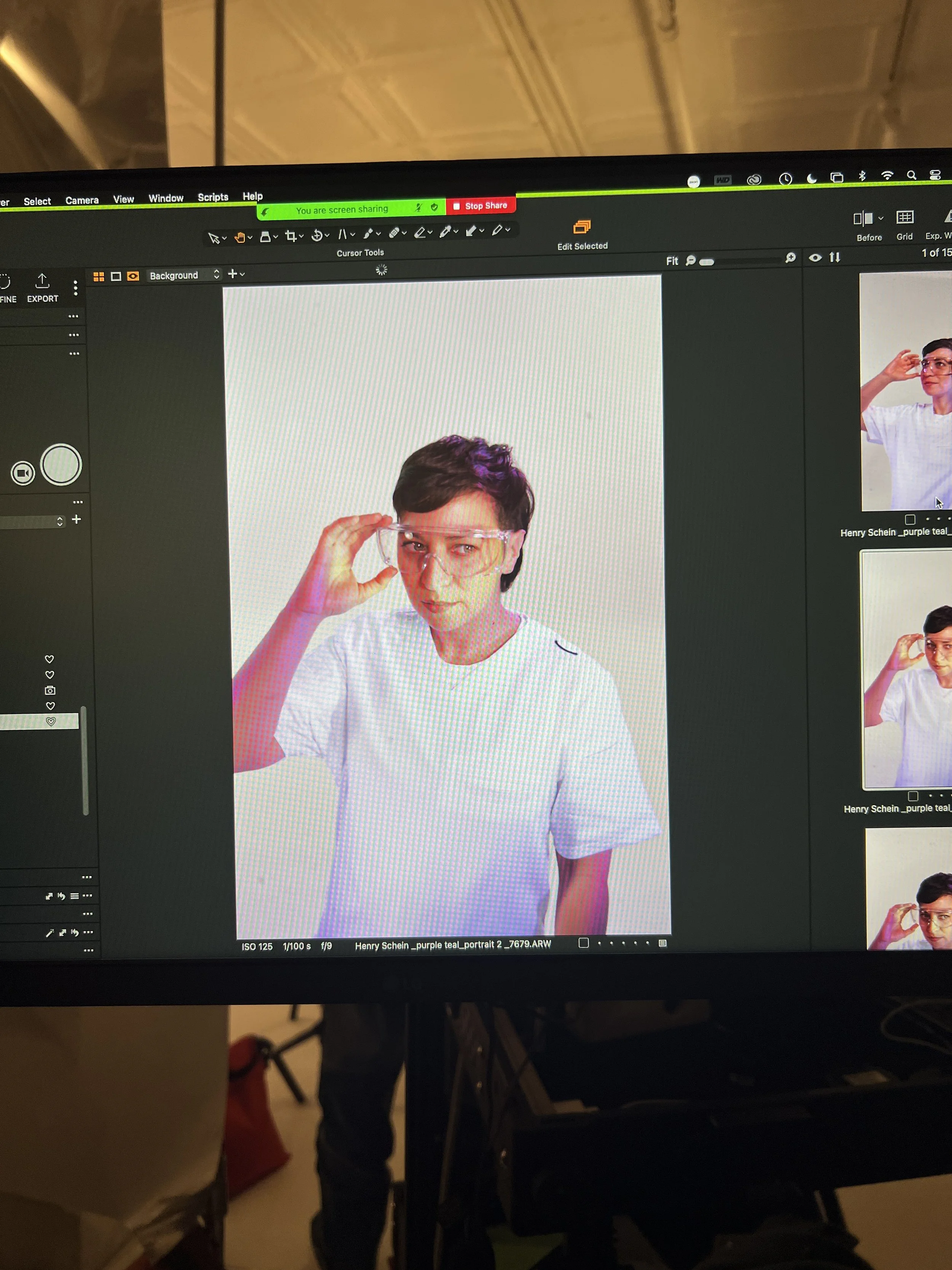
Behind the Scenes
